|
As pChart was able to both manage high quality drawing primitives and a way to store raw data it was
time to write some charting functions. Today people only know this library because of this even if it
was not the initial purpose of this library. pChart supports the widely used charting methods like
plots, line, curve, bars, radars, polars,...
Include all the standards charts |
Standard charts
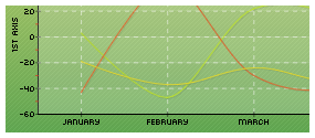
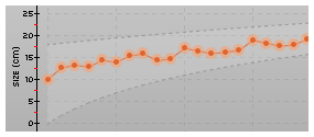
All standard charts present in the first version of the library are still there. You can create plot, line and curve
charts easily and play with all the rendering options to get the best visual result for your applications. All charts
will be drawn with the scaling configuration you'll make first : you can reverse the X and Y axis, tune the scales, ...
See more in the documentation..
|
|
Extensive support for bar charts |
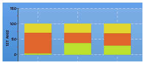
Bars, stacked, normalized charts
Bar & stacked bar charts are also part of the base charting methods. You can use the normalize() function to create 100%
stacked charts.
See more in the documentation..
|
|
Radar an polar charts at their best |
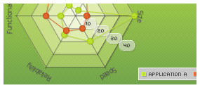
Radars and Polars charts
Radars and polars charts have been completely rebuilt from scratch to allow a deep configuration of the rendering. This
two charts families now provide a great visual experience allowing you to easily highlight your data.
See more in the documentation..
|
|
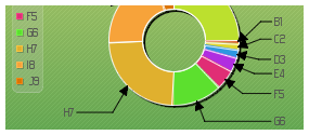
2D and 3D Pie charts |
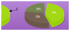
2D and 3D pie charts
You can create both 2D and 3D pie chart using the pPie extension. Both families can be deeply customized
to allow you an easier integration in you current web application design.
See more in the documentation..
|
|
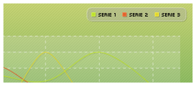
Various legend box styles |
Legend boxes support
Don't forget to write your data series legends! pChart can draw it for you in different formats,
choose the orientation, colors and layout.
See more in the documentation..
|
|
Mix the styles and charts |
Area charts
Display multiple data series on the same chart, play with the transparency and the shadow to create
nice looking charts.
See more in the documentation..
|
|
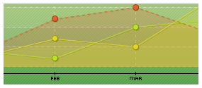
Stack your data, compare their values |
Stacked Area charts
Stack the areas of your multiple series to hilight value and zones thickness.
See more in the documentation..
|
|
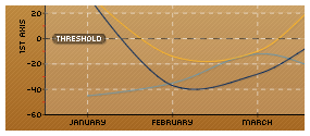
Add vertical or horizontal thresholds |
Thresholds
You can add thresholds over your charts to highlight specific values. Thresholds are written
on a per axis basis.
See more in the documentation..
|
|
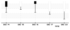
Financial stock charts |
Stock charts
Represent your stock quotes evolution during time with the stock chart extension.
See more in the documentation..
|
|
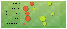
Easy to read bubble charts |
Linear bubble charts
Represent your 2D data with the well known bubble chart layout. This kind of charts are generally used
when an linked variable is affected to each points.
See more in the documentation..
|
|
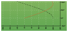
Support for scatter charts |
Scatter charts
Draw scatter charts providing X and Y data series using the pScatter class extension. As of
today you can use this class to draw plot, line & spline charts.
See more in the documentation..
|
|
Draw both 2D and 3D ring charts |
Ring charts
The pie chart class also allow you to draw both 2D and 3D ring charts.
See more in the documentation..
|
|
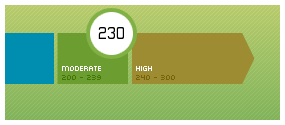
Use indicators in your dashboards |
Indicators
pChart is introducing new family of data visualisation methods. This chart called indicator arrow
can be easily adapted for your needs, just give it a try!
See more in the documentation..
|
|
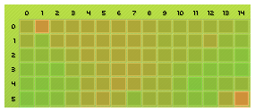
Surface charts |
2D Surface charts
2D surface charts can be used to represent data in 2 dimensional matrix. This kind of charts are used
to analyse visually elevation maps or genetic genes distribution.
See more in the documentation..
|
|
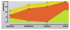
Create zones between your data series |
Zone charts
You can highlight your data variations by using the zone chart functionality allowing you to
draw zones between two datasets.
See more in the documentation..
|
|
|
|